The Craft Behind HackDavis
December 10, 2018 • 5 min read
Overview
The perks of staying in the Bay Area is the abundance of tech events, conferences, and hackathons. I went to my first hackathon with Chris Wong in 2015. I was addicted to it since then. Having joined multiple hackathons, I learned a lot of valuable lessons. And honestly, I couldn't have learned those skills in college. That's why I aimed to give back and contribute to the hackathon community.
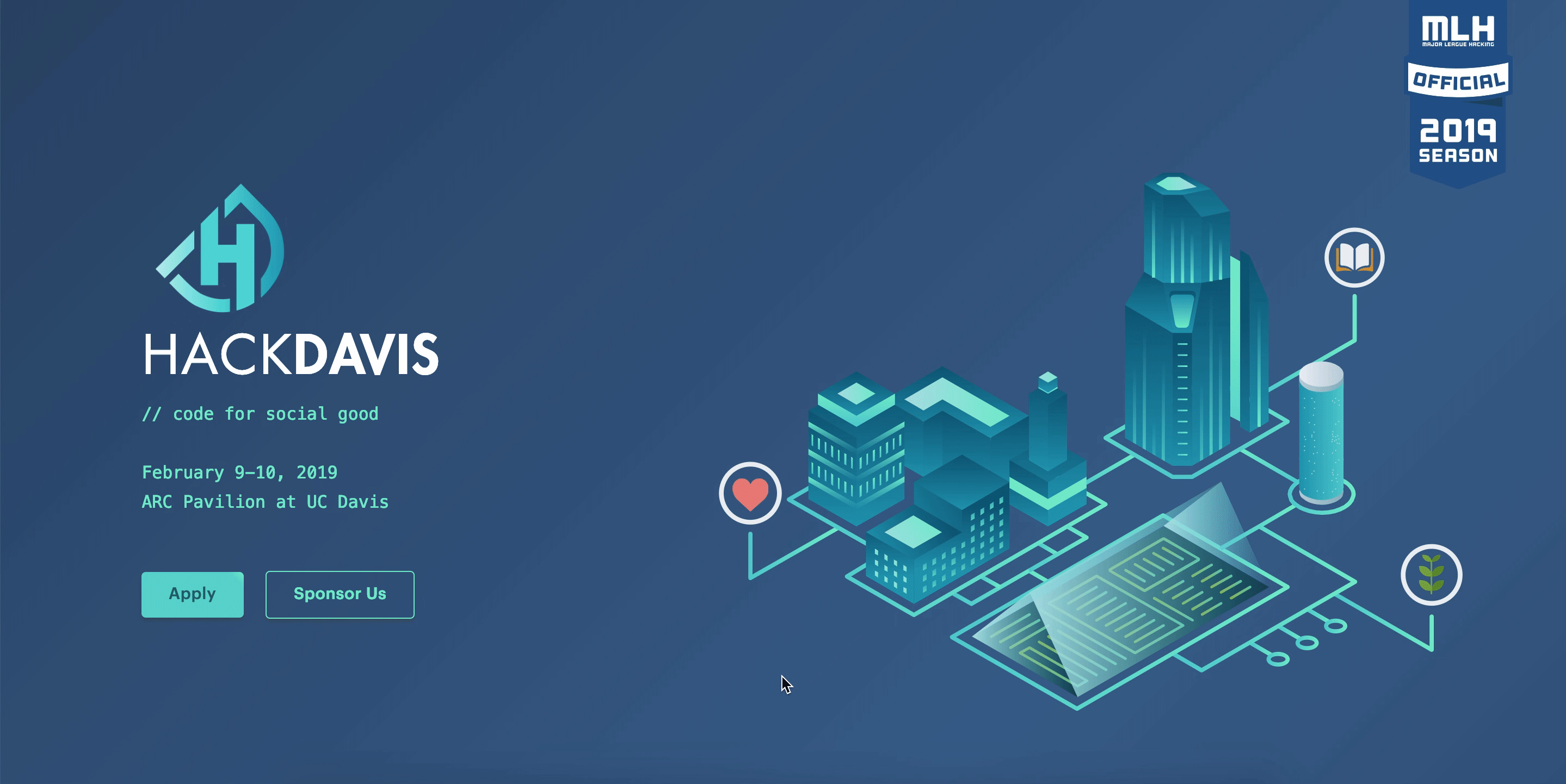
Fast forward to October 2018, I started working on the official website of HackDavis 2019. Launched in November 2018. Check out the code.
Initial Thoughts
Research
Based on my previous hackathons, it comes pretty intuitive to me as what a user usually looks for in a hackathon website. They want to know what it is about, when is it happening, when can they submit their application, do they need to create an account, is there a waitlist, who are the sponsors, is it sponsored by MLH, how big is the hackathon, what are the past success, what is the theme of the hackathon, who are the judges, what are the prizes and on and on. I have divided them into 7 components:
- Landing
- About
- Theme
- Schedule
- FAQ
- Sponsorship
- Social
User needs
Before developing the website, it is very important to start off by thinking who are my clients and what can I do to make sure they get what they want from the website and make them stay.
Branding
Personal. Appealing. Light. Simple.
Logo in use


Check out more logo designs designed by Michelle.
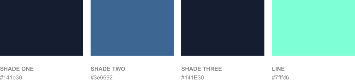
Color
It wasn't easy coming up with a color palette. I went through many trials and errors with the help of this source. Initially, I set the background as #fff, however, it didn't feel right. In the end, I've decided to use a dark background.

Consistency
The Line with #7FFFD6 — Throughout the site, I've specifically set the same color of the lines to contrast with the background.
The Underline on subtitles — I've added gradient background under the subtitles. In fact, I've considered placing different objects or slanted lines to follow the trends. But I feel like by adding a gradient line under each subtitle, it made them really stood out and helped users to grasp their attention when they are scrolling the site.
Personal Touch
To enhance the user experience of the site, I've added multiple subtle motions to help users navigate the site.
back to top btn — to help users go back to the landing page.
progress bar — to show the current progress of completely scrolling the site.

cc: Typed.js and Transitioning Gradient Background
Tech Stack
Since I wanted to quickly prototype the website, I acquired the KISS principle by using the following tools:
- Bootstrap (responsiveness)
- HTML
- CSS
- jQuery (progress bar, scroll to top)
- Vanilla JS (toggle accordion)
After each commit, Netlify automatically deploys and shows us the preview page on an individual URL. I've received many feedbacks and design critiques from the team with the help of Netlify 🤘
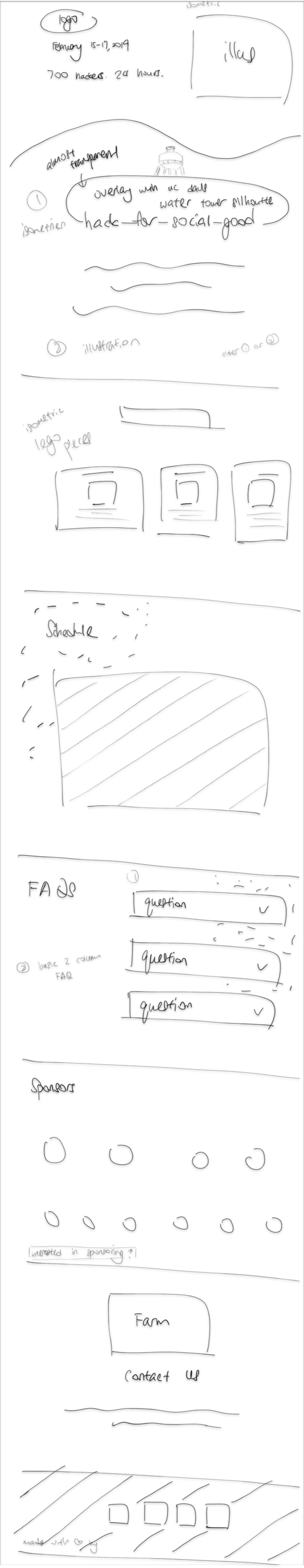
Ideation
My initial sketch of the site on Notes 😬:

My role
I worked closely with the designers. I made sure the illustrations were aligned to the theme. I sought unbiased opinions to understand how they feel when they browse the website. I tweaked the website accordingly. I added a couple of subtle motions throughout the site to exhibit the distinct personality of 2019's website. Until the end, I made sure every browser sizes and breakpoints are taken care of. With the idea of keeping the website lightweight, I made sure every asset and source code are optimized. I've also made sure that SEO and all of the meta tags are working perfectly for different social websites.
Learnings / Challenges
- Get more design critiques. Getting design critiques was crucial during the process. I designed and developed the website by only focusing on the users. With an extra pair of eyes, I avoided making some color contrast adjustment and misuse of typography.
- Keep the landing page simple. How fast the website is being loaded and what information is shown to users affect the time they stay on the website. I added a typing motion to grasp users' attention. On top of that, I added a moving gradient to the background of the landing page. It is very subtle that not all of the users may notice but the ones that do notice it, this makes them intrigued.
- Animating the illustrations. There is too little time to implement due to the lack of knowledge in the SVG animations. It would've been cool if the pipes of the illustration of the landing page could animate when the users first arrive at the site.
Conclusion
I hope that these decisions provide clarity in the development and the design process of HackDavis 2019.


Thanks to Michelle Gore, Henry Moore and Kaelan Mikowicz.
That's it for now! 🙌
If you haven't checked out the website, check it out here. If you'd like to learn more about my past hackathon experience, read here.
Peace out 🐾